Color isn’t just a splash on canvas; it’s an entire language. In the world of a contemporary art gallery, color is one of the most powerful tools artists and curators have to stir emotions, convey meaning, and craft unforgettable visual journeys. Whether you’re visiting a minimalist exhibit or a wildly expressive installation, color plays the role of a silent guide.
Colors have the uncanny ability to affect our moods. A burst of red might energize you, while a soft blue can bring on calm. In a modern art collection, curators carefully select and organize pieces based on their emotional resonance. They know that color can be the first thing that connects a visitor to the art.
The right use of color helps build a visual roadmap through a space. Bright colors pull us in. Muted tones help us linger. In any serious art collection gallery, you’ll see how color directs your attention and invites you to explore deeper.
Lighting doesn’t just illuminate—it transforms. Natural light changes throughout the day, shifting how colors appear. Artificial lighting in private art galleries is designed to maintain color consistency and minimize glare, ensuring each piece appears exactly as the artist intended.
Cool lighting might make blues pop but can mute reds. Warmer lighting does the opposite. This knowledge is crucial in presenting a fine art collection in the best possible way.
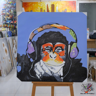
Reds, oranges, and yellows are energizing. They can symbolize passion, joy, or even danger. These shades are often central in expressive works and can anchor entire sections of a curated art collection.
Blues, greens, and purples foster calm and introspection. These hues dominate installations that aim to slow the visitor’s pace and invite deeper reflection.
Good curators are storytellers. They use color to guide visitors from one section to another, building an emotional narrative throughout the exhibit. In a quality art collection gallery, you’ll notice the transitions feel intentional—because they are.
Strategic use of background wall color or spotlighting ensures that certain pieces stand out, even in a room filled with captivating work.
Expressionist works often lean into bright, aggressive palettes to evoke raw emotion. These styles are popular in any evolving collection that seeks to push boundaries.
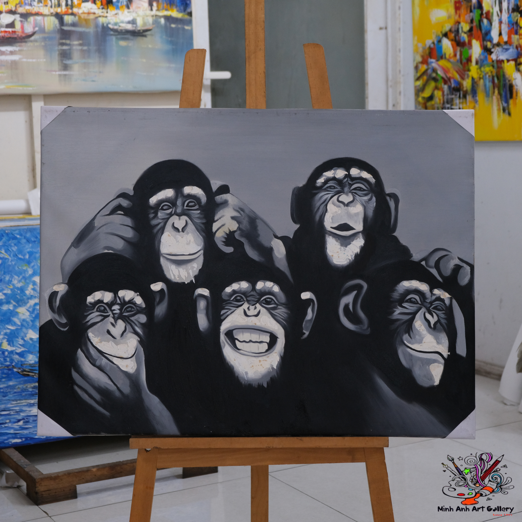
On the flip side, minimalism favors simplicity. Black, white, and grayscale dominate this approach, highlighting form and space more than vibrancy.
Additive color (light-based) and subtractive color (pigment-based) are essential concepts. Museums and art gallery exhibitions consider both when deciding how best to present a piece.
From crushed insects in ancient times to modern synthetic dyes, pigments tell stories of science and culture. The richness of some hues even signifies wealth or rarity in a famous art collection.
Paintings, sculptures, digital installations—they all have unique color properties. A truly cohesive fine art collection balances these differences to feel unified, not chaotic.
A frame isn’t just a border. It influences how we perceive the colors within. Likewise, wall color can enhance or detract from a piece’s palette.
Surveys and observation help galleries understand how color choices affect visitor moods, dwell time, and even purchasing behavior.
Some art gallery exhibitions incorporate touch panels or lighting changes, letting visitors play with color in real time—making art a two-way experience.
Curators might dedicate entire rooms to a color theme, enhancing immersion and emotional engagement. This approach is common in ambitious art gallery collection tours.
Certain pieces, especially older ones, are sensitive to light. Smart lighting systems adapt throughout the day to protect and present them accurately.
Colors on screens are made of light—RGB—and they rarely match pigments exactly. Online exhibits must be calibrated carefully for color integrity in any art collection online.
Scanning, photographing, and rendering digital files requires expert color management so collectors and viewers see the true essence of each piece.
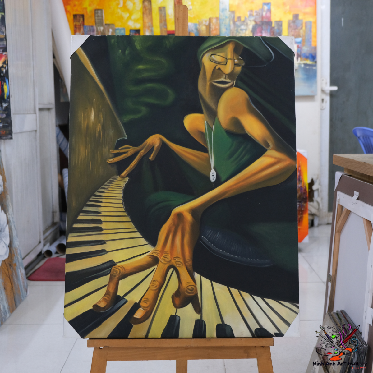
His use of yellow symbolized both joy and madness. It’s a color story that adds depth to any piece found in a famous art collection.
Picasso’s cool, melancholic tones reflected a time of grief. This emotional depth is a striking example of how color tells personal and universal stories.
AR allows viewers to change wall colors or lighting virtually, seeing how a piece fits into different environments—a major innovation for private art galleries.
AI can suggest personalized routes based on a visitor’s favorite hues, making each tour unique and deeply immersive.
Color is far more than decoration—it’s the beating heart of artistic communication. In a world where attention is fleeting, color grounds us, guides us, and helps us feel. From classic works to immersive tech, the science of color breathes life into every contemporary art gallery experience. Whether physical or digital, curated or spontaneous, the thoughtful use of color is what makes an art visit unforgettable.
1. Why is color so important in art gallery design? Color impacts how we perceive and emotionally respond to artwork, influencing the entire gallery experience.
2. How do galleries ensure color accuracy in digital displays? They use color calibration tools and lighting controls to maintain the truest version of each piece in an art collection online.
3. Can lighting really change how art looks? Absolutely. Light temperature and intensity dramatically shift how colors appear to the human eye.
4. What role does color play in famous art periods? Color often defines entire eras—like the Blue Period for Picasso or the explosion of neon in postmodernism.
5. Are there technologies that enhance color in art galleries? Yes! AR, AI, and interactive lighting systems are transforming how visitors engage with color and space.
Message:
Minh Anh Art Gallery | 101 Bui Vien St, District 1, Ho Chi Minh City, Vietnam
Phone: (+84) 962 720 484
Email: minhanhart.vn@gmail.com
Website: https://minhanhart.vn/